Flik Flak x Le Musée du Louvre
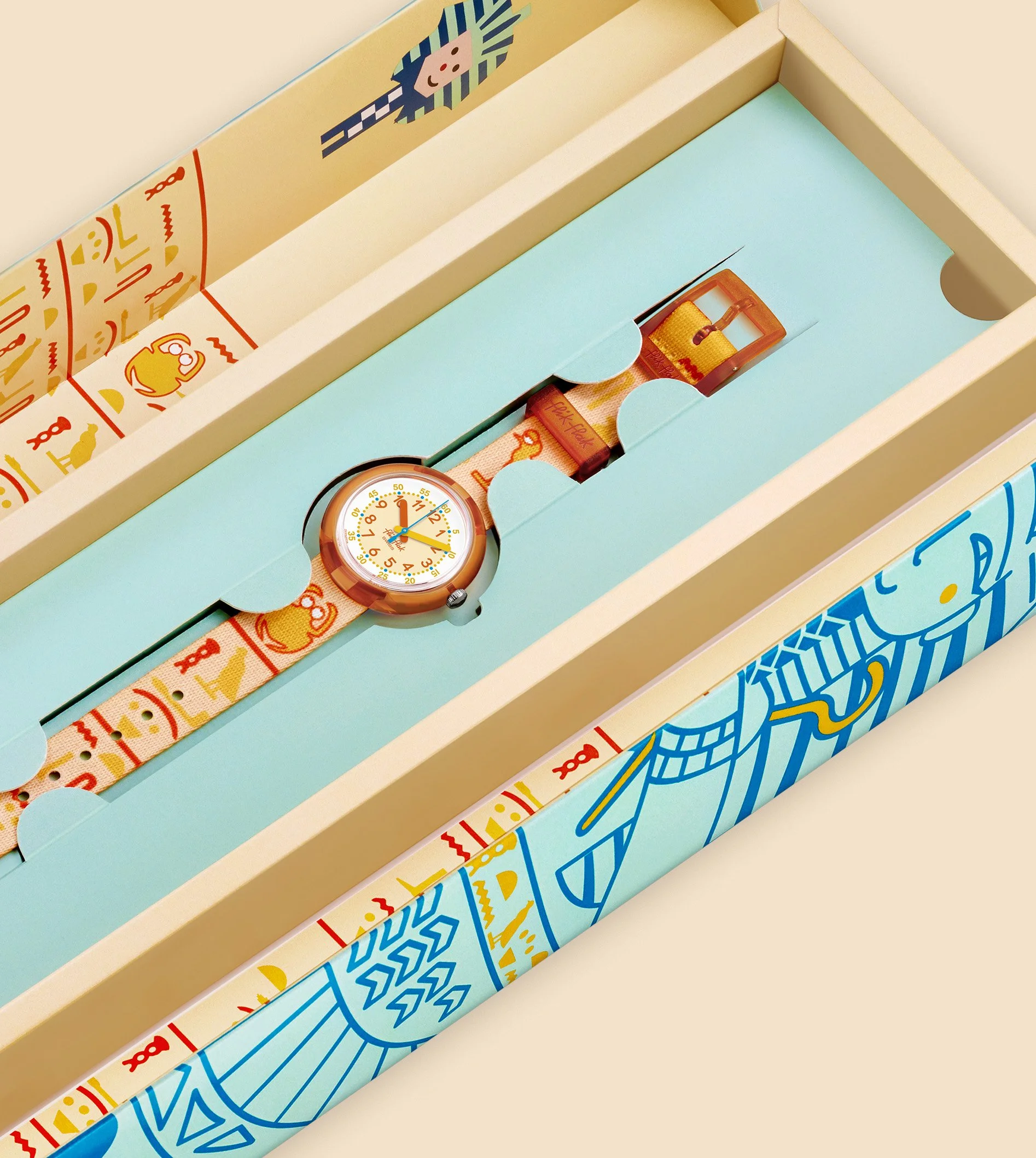
For the collaboration Flik Flak X Le Musée du Louvre, the brand launched two watches and a special packaging with a poster for learning the language of hieroglyphs through riddles.
Art direction | Watches design | illustration | packaging | poster design | PR texts | marketing material : website, social media, animations, and newsletter assets.
To mark the 200th anniversary of the deciphering of hieroglyphics by Champollion, Flik Flak launched two new watches on the theme of ancient Egypt. The objectives for this collaboration were to design a special box with a poster with games and two watches, one about the iconic blue hippopotamus and one with hieroglyphs. The hippopotamus was often found on archaeological digs. I decided for this watch to twist a bit the original blue color to a fresher blue-green one and to create a pattern with vegetal motives that are on the figurine.
For the other watch, I’ve designed funny hieroglyphs elements in an orange-yellow color, that reminds the desert and the pyramids, which is beautifully complementary to the blue first watch. Each watch has their seconds hand of the main color of the other watch to create a link: a yellow seconds hand on the blue Hippo watch and a blue seconds hand on the orange hieroglyphs watch.
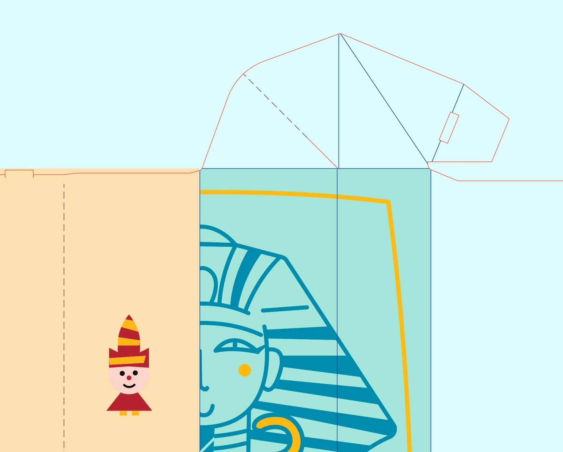
I have designed the special packaging as well on the theme of the pharaohs and a poster with games.
For the stores, I have developed visual merchandising assets and guidelines.
We had a special activation in Paris for the launch of the two watches and I provided a visual merchandising for this event. Following the brief of the marketing project leader, I have created the material for the web and social media.


